5 Year Anniversary Update! 0.22 Bug Fixes, Color Corrections!
Hey everyone, Kev here!~
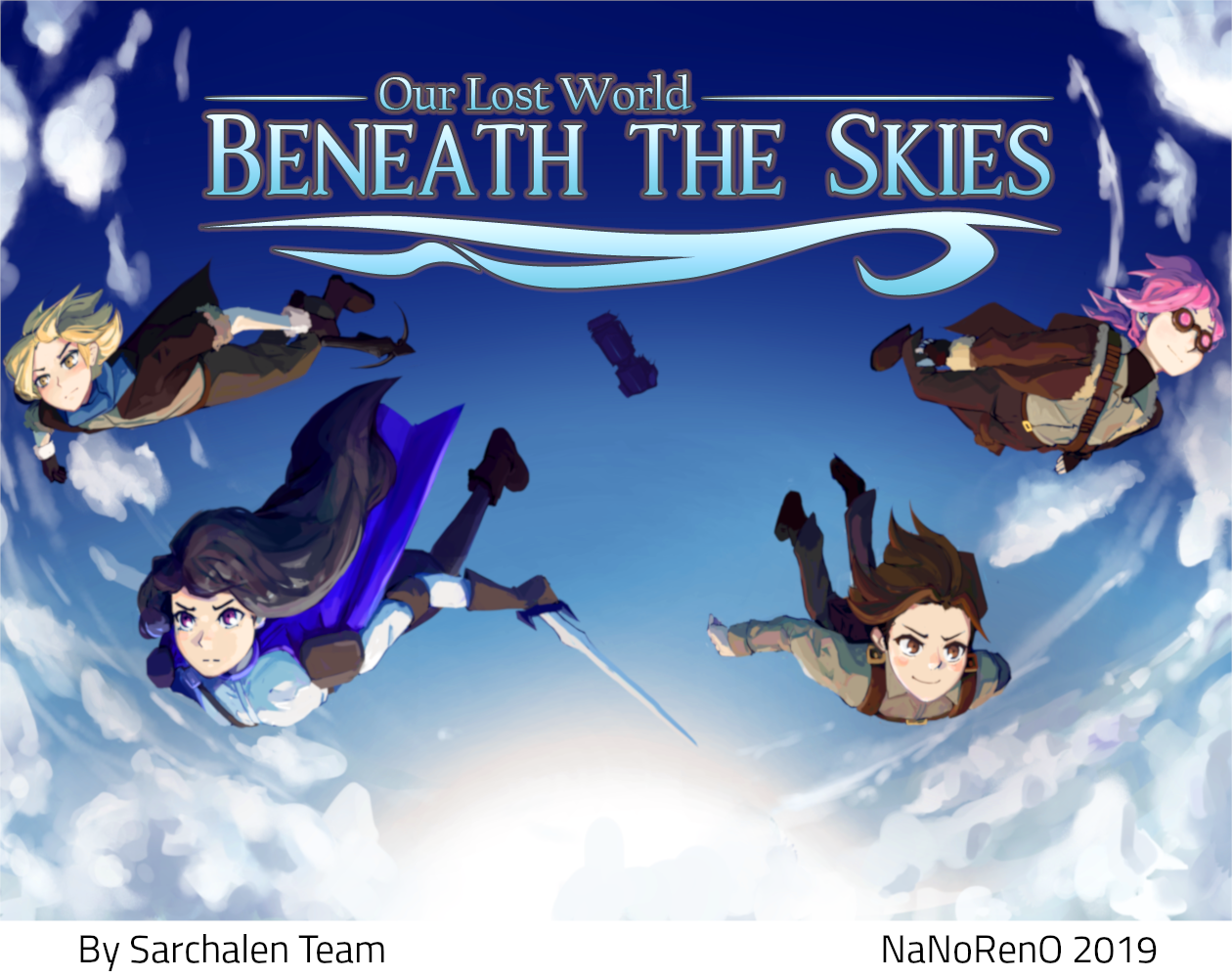
I'm amazed it's been 5 years since we released the first version of Our Lost World Beneath the Skies for NaNoRenO 2019! Before I get into this devlog,I want to first thank everyone who's been following us since this release, as well as newcomers who may be checking out the game for the first time!
"Beneath the Skies" is a VN which holds a lot of significance in my heart. Firstly, because it was my first time putting a team together specifically for a jam! Second, because this was, in my opinion, the first VN where we really started to find our "style", and you can see its influence in our newer games. There are things we did well, that we've continued and built on, and things that we've learned from and improved on as we have grown! Now, with our 5th title now underway and the rebranding to Illusory World just about complete, I think it's time to give this game some much-needed attention!
This update includes some things that have been on my mind for awhile. It includes bug fixes, most of which were picked up by the community, and a couple new ones I discovered while working on the update!
The patch also includes a few new things! Some of them are new Ren'py features that have been added over the years. Some are quality of life improvements that I've picked up as we've worked on other games, and one or two are just for fun!
Here's a brief overview of what the patch includes:
Color Correction!
Many of the backgrounds now have color correction to help improve the overall tone and feeling of each scene. For instance, if we look at the background for the flaker berth:
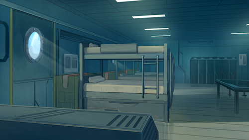
This is the resting/sleeping quarters our squad lives in, somewhere deep in the lower decks of the ship, where Tallara often gets confined to and made to be bored out of his mind. We want to give it that feeling of being cold, dreary, and more...steel.
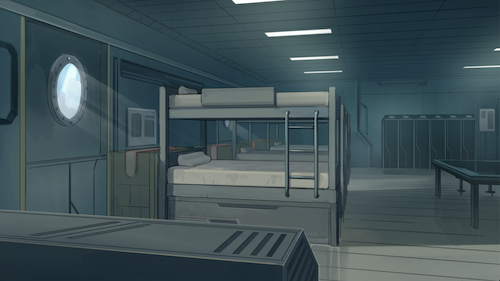
The new colors are a bit duller/desaturated, and the blues are turned slightly down to make it feel like a cold, dull crew quarters on war ship. Take a look, do you think it makes a difference?
To show a different example, take a look at the command deck background. This is a place at the front of the ship with huge windows that look out into the world. I made this one just a little bit brighter, and a little more blue/violet to try to simulate the "daylight" look.
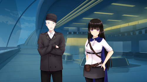
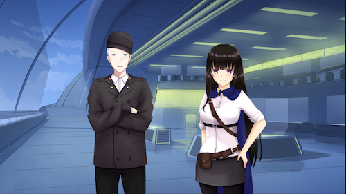
These will probably need some more adjusting in the future (does that yellow look a little green to you?) , but now that we have the feature implemented it's relatively easy to do minor color corrections to anything in the game, including sprites, GUI elements, backgrounds etc.
Sprite animation changes:
Over the years I've had the privilege to watch a few people play through our VN and give feedback. One of the most common issues mentioned is how slow the animation times are between sprite transitions.
What I noticed is that this game, for some reason, is scripted mostly to have only one character on the screen at a time! What that means is that if two people are having a back and forth conversation, the interaction looks something like this:
Background appears with a half second fade
Magnus appears with a half second fade
He says his line, and then disappears, with another half second fade
Iris begins to appear, taking another half second before saying her line
And then taking a half second to fade out.
Magnus appears again, with a half second fade
Etc.
That's a lot of half second fades in between characters speaking. Why did we do it like this? I don't know :( But let's fix it.
I've made two changes to address this. The first, is to reduce the global transition time to .5 seconds. That means at most, it will take half a second from one sprite to fade into another. The second change is to reduce the global "say with attributes" transition time to .1, or a tenth of a second. This is where characters change their expression, from happy to sad, for instance. With an ease warper, this looks a lot faster and more fluid overall.
This doesn't quite fix all the issues with sprite timing, but it gets us a lot closer without having to re-script the whole game! Give it a try and tell me what you think!
Bug fixes:
Radio buttons in the settings menu actually work now!
Why didn't anyone tell me those things were so hard to click with a trackpad???
I've bumped up their borders from 4 pixels to 12. Also moved the skip settings radio buttons closer to their label so you can actually tell what they control.
Text in the text box
Text will now stay in the middle of the box vertically. No more will the lines of dialogue be floating up or down on the box depending on the length. Now the text always starts at the top of the box, and succeeding lines go below it, just like reading a page. This just looks better and more consistent with what you'd expect of a VN. Don't know why it wasn't done that way originally. I also slightly expanded the width of the text.
Planned features:
These are just a couple things I'm looking at adding to the game in a future update. They are not yet "in development" per se, but they are on my mind!
GUI overhaul.
We've learned a lot about how to make a good VN GUI over the years, and I'd like to bring some of those features over to this game as well! I'm thinking at minimum we'll add the right click 'pause' menu, similar to how we have in Forged in Ice and Unbearable Crush. I've gotten a lot of great feedback on that feature and I think it ought to be the standard for all of our games going forward.
Side images!
This is something I've done with all our recent games. A character portrait for the speaking character will appear in the bottom right of the text box to let the player know who's speaking, even if they're off screen. 
The GUI for "Beneath the Skies" was actually designed with side images in mind, but they were never fully implemented due to time constraints of the jam. I'm going to talk with the art and scripting teams to see what it'll take to put those into the game.
Story updates?
In short, will we be returning to the story of Beneath the Skies?
This one is honestly still a solid "maybe." I've talked with the writing team about it, and there is defenitely interest, but we're probably looking at putting together a new project if we go that route! I think Beneath the Skies is a really cool look into this world we've created. It was also conceptualized and written at a time when we were all very young and inexperienced writers, and we could probably do a lot more with a sequel or successor rather than a direct continuation. But we'll see! I know some of you guys have been asking about it. I promise I have not forgotten!!
Thank you again to everyone who supports our team and what we do! The new update to Our Lost World Beneath the Skies is playable now for free!
Files
Get Our Lost World - Beneath the Skies
Our Lost World - Beneath the Skies
A short fantasy skydiving adventure concept
| Status | Released |
| Author | Illusory World |
| Genre | Visual Novel, Adventure |
| Tags | Anime, Comedy, Cute, Fantasy, Post-apocalyptic, Sci-fi, Story Rich, waifu |
| Languages | English |
More posts
- Update 0.21Apr 08, 2019
Leave a comment
Log in with itch.io to leave a comment.